Media S
Media Studies AS
Music Magazine Evaluation
Chloe Carroll
Music Magazine Evaluation
Chloe Carroll
We was given a brief were we was asked to make a music magazine which included a front cover, double page spread and contents page. The magazine had to be original and we had to use all the conventions of a real music magazine. We had to include four or more original images which where appropriate for our chosen genre. The genre of music my magazine is indie/rock/alternative which is quite similar to such established magazines as NME or Kerrang. This is why I researched and analysed three magazines, which were Kerrang, NME and Q. I analysed the fonts, language and images of these magazines which helped me to understand the conventions and ways in which a music magazine is continuous throughout and professional looking. As NME is the same genre of the magazine I will be creating the audience I will be aiming my magazine at, is their audience too. My audience is a mainstream audience of 16-24; they are mainly male and are completely obsessed with music. I decided to name my magazine ‘YMB’ which stands for ‘Your music Bible’; I chose this name out of three which were ‘Your Music Bible’, ‘Talking Shoe’ and ‘The Tramp’. I decided on YMB because I created a poll on my blog where people voted for the best suited for my magazine. I also think ‘Your Music Bible’ is appropriate because it describes the audience in which its aimed at which is being obsessed with music almost religiously, hence ‘bible’. I asked 10 people what they thought the genre of my magazine was and all of them circled ‘indie’ and ‘alternative’.
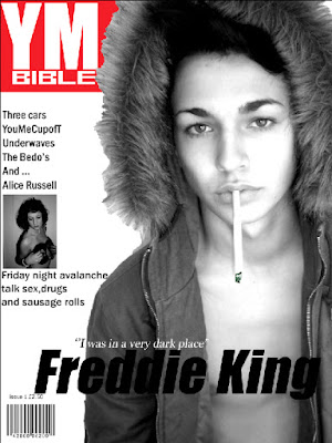
On a shelf in a shop a magazine has to stand out, so it is vital your front cover stands out to the rest. I used white, red and black because they are very eye catching, helping it stick out to a passer by it also looks professional in conjunction with the grey scale images. Conventionally the artist on the front cover looks directly at the camera so it looks like they are looking at the reader so when taking the images for my front cover I made sure my model was looking directly down the lens. I dressed my model in a kaki parka which you associate with the ‘indie’ scene, I also had him with no top on underneath, I did this because it looked more like a professional, posed image. I put a cigarette in his mouth because it’s obviously a bad thing to do but smoking is associated with the indie scene and many artists do it. When I asked 10 people between the ages of 16-18 if they thought my images where appropriate, all of them said ‘yes’.
I named the artist Freddie King because it sounds like an artist name like Pete Doherty. As the main image on the magazine dominates the full thing I decided to add only one more image to the front cover. The image I added was black and white which matches the main image, I think black and white makes them look more professional than a colour image. The photo is of an artist I created called Alice Russell. She is posed naked with two small vinyl’s covering her breasts however she is looking away from the camera, making her look vulnerable which in a way contradicts itself as she is happily posing naked. I chose two images out of the ones I took of the artist of Alice
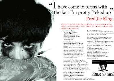
As the interview on the double-page spread with Freddie King is very personal to him, the image reflects it. I took it up-close and I had his arm covering his face to show he has secrets and he looks quite scared. However his eyes look quite scary in a way but by putting the black eyeliner underneath his eyes make him look like he has been crying. I think though that some rock-stars do wear eye-liner so it shows that he is not afraid to be different as make-up is associated with girls. I wanted him to look like an edgy artist so I used a fabric sleeve tattoo on his arm and edited it on Photoshop to make it look legit. I used a quote I pulled from his magazine which says “I have come to terms with the fact I am pretty f*cked up” I used this quote because I think it sums up the entire interview as it mentions his personal life.
As the interview on the double-page spread with Freddie King is very personal to him, the image reflects it. I took it up-close and I had his arm covering his face to show he has secrets and he looks quite scared. However his eyes look quite scary in a way but by putting the black eyeliner underneath his eyes make him look like he has been crying. I think though that some rock-stars do wear eye-liner so it shows that he is not afraid to be different as make-up is associated with girls. I wanted him to look like an edgy artist so I used a fabric sleeve tattoo on his arm and edited it on Photoshop to make it look legit. I used a quote I pulled from his magazine which says “I have come to terms with the fact I am pretty f*cked up” I used this quote because I think it sums up the entire interview as it mentions his personal life.
I think my magazine represents the social group of 16-24’s in a in which people expect them to be. So things like being individual, loving to socialise and listen to music. The social group however sometimes are seen in a bad light relating such things as grime music to knife crime which I don’t think is fair. Included for my social group was opportunities to win tickets and hot new bands to check out because that’s what they feed on. They love to be the first person to hear a new band or have the opportunity to go see them live.
The ‘indie’ look is not fancy or ‘nice’ so when choosing the fonts I didn’t want something pretty. So I decided on ‘Georgia
Bauer media would be the institution I would choose to produce and distribute my magazine because they don’t sell a magazine the same genre as mine so they wouldn’t have to compete for the same audience however my magazine would be up against the popular and established magazine NME. For my audience feedback questionnaire I asked if they would purchase my magazine by just looking at the front cover, 4 people out of the age range 16-18 said ‘No’, one persons reason was because they didn’t like that genre of music. The other 6 out of the 10 said ‘Yes’ because they liked the image and the main cover line as it made them want to read on.
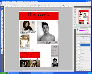
I have learnt a lot about how to use Adobe Photoshop whilst doing this project and my skills have increased. I also know now how to use the online blogging site Blogger as I posted all my work onto there, I liked using it as its easy to access and other people are able to look at your work.
Looking back at the preliminary task I feel I have progressed hugely as I didn’t use Photoshop to construct my college magazine instead I used the new version of Word and Paint. So when I look at it now I see how much more better it could have been by using Photoshop as it looks more professional and there are a lot more things you are able to do. I loved doing the project as I learnt a lot about institutions and how magazines work. I struggled at first with the technology such as Photoshop, but it all became so much easier as I went on. I think I was strongest in my images as I thought about such things as stance, clothing and that certain individuals ‘look’. Overall I am proud with my magazine.
Looking back at the preliminary task I feel I have progressed hugely as I didn’t use Photoshop to construct my college magazine instead I used the new version of Word and Paint. So when I look at it now I see how much more better it could have been by using Photoshop as it looks more professional and there are a lot more things you are able to do. I loved doing the project as I learnt a lot about institutions and how magazines work. I struggled at first with the technology such as Photoshop, but it all became so much easier as I went on. I think I was strongest in my images as I thought about such things as stance, clothing and that certain individuals ‘look’. Overall I am proud with my magazine.


